How to Use the Walters State Logo
Walters State’s logo is a visual representation of the college’s mission and values. The logo design honors the college’s tradition and commitment to serving our community, in the past, present, and future. Original artwork should always be used to reproduce the college’s identity. The logo should not be altered or recolored in any way.
WSCC Logo Toolkit
The Walters State Logo Toolkit includes high-res and vector logo files.
Logo Usage
Original artwork should always be used to reproduce the college’s identity. The logo should not be altered or recolored in any way.
WS Vertical Logo
WS Horizontal Logo
Colors
Walters State’s primary brand colors are Pantone/PMS 289 dark blue and Pantone/PMS 199 red. The primary colors are recommended for use in spot-color, offset printing.
For four-color process (CMYK) printing, the specifications shown at the bottom right
match the PMS colors as closely as possible.
For websites or screen graphics, the RGB colors should be used. RGB colors are intended
to match their PMS counterparts as closely as possible and should not be used for
print applications.
These colors can be used to highlight headlines, sub-headlines, and secondary messaging. The use of these colors can also extend to background colors. Tints or percentages of color are only recommended to be used on PMS 289, dark blue.
Pantone 289
CMYK: C: 100, M: 76, Y: 12, K: 70
RGB: R: 0, G: 22, B: 65
Pantone 199
CMYK: C: 0, M: 100, Y: 72, K: 0
RGB: R: 233, G: 21, B: 64
Logo on Primary-Color Backgrounds
The Walters State logo can be used on either one of the primary-color backgrounds. Please request an official logo designed for this use. The primary color used as a background will appear reversed to white within the logo.
These color guidelines will be the same for both the horizontal and vertical logos.
Vertical Logo on Blue
Horizontal Logo on Blue
Vertical Logo on Red
Horizontal Logo on Red
Black and Reversed-to-White Logos
The Walters State logo can be used as a black, one-color logo or it can be used as a reversed-to-white logo on a solid-color background. The reversed-out option is preferred when there is not enough contrast for the two-color logo.
The black logo is recommended in one-color printing, such as business forms and reply cards.
These color guidelines will be the same for both the horizontal and vertical logo.
One-Color Vertical Logo
One-Color Horizontal Logo
Zone of Isolation
The area indicated around the Walters State logo is known as the zone of isolation (the area isolating the logo from other elements or text, including the edge of the page). To ensure the clarity of the identity, this area should be kept free of any type, imagery or graphic elements.
The preferred zone of isolation is one “S” space of the logo. This is the “S” that is used in the “WS” graphic. This clear space is applied to all four sides of the logo and is proportionate to any size logo. This zone of isolation is the same for both the horizontal and vertical logos.
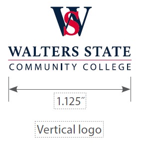
Minimum Reproduction Size
The horizontal logo design logo should not be reproduced any smaller than 1.5 inches in width and the vertical logo design should not be reproduced any smaller than 1.125 inches. Any identity needed smaller than this should be created using one of the primary type fonts.
WS Graphic Mark
The WS graphic element which makes up the Walters State logo can also be used as an occasional stand alone graphic. The stand-alone WS is mostly used in athletics and student apparel such as uniforms, caps and T-shirts. Whenever the WS is used as a standalone graphic , the same color guidelines apply as with the Walters State logo.
The WS graphic element should never replace the Walters State logo but only be used a secondary identifier for the college.
WS Graphic Mark
One-Color WS Graphic Mark
WS Graphic Mark on Blue
One-Color WS Graphic Mark on Red
Incorrect Usage
Always use the official Walters State logo.
Some incorrect uses of the logo are shown here. Always use the original graphics and do not alter the artwork.
![]()
Do not alter the logo in any way such as stretching horizontally or vertically.
![]()
Do not change the sizes of any of the two logo elements.
![]()
Do not recolor the logo in any way.
![]()
Do not substitute the logo text with another font.
![]()
Do not use on a colored background that will compromise legibility.
![]()
Do not use the white/reverse version on light backgrounds.
![]()
Do not use on busy photography or patterned backgrounds.
These examples of incorrect usage apply to both the horizontal and vertical logos. If there are concerns on the proper usage of the logo, contact the Communications and Marketing Office.
Obsolete Logos and Graphics
The previously approved Walters State Great Smoky Mountains Community College logo should no longer be used except in cases of historical reference.
Previous versions of the interlocking WS logo should not be used.
![]()
Contact Communications and Marketing
For more information contact the Office of Communications and Marketing by email or phone at 423.585.6998.
Events
- Jul 14
- Jul 16
- Jul 25
News
- June 29, 2026
- June 25, 2026
- June 17, 2026